BumptUp
Making the jump from lab to App Store
Product Redesign, Platform Migration + Clinical Innovation | Fractional CTO | 2022–Present
Long story short
The setup
BumptUp began as a research study in Western Kentucky led by Dr. Rachel Tinius to test how regular exercise during pregnancy could improve outcomes for both mothers and babies. The results were promising. Especially among low-SES populations.
But the prototype app was built solely for trial purposes. Minimal UX consideration. No commercial path forward.
The challenge? How can we turn clinically validated research into a product that's easy to use, emotionally supportive, and built for real pregnant people... not personas?
This wasn't about taking good research and making it pretty. It was about transforming a clinical tool into something that could actually help people at scale. Without losing the scientific integrity that made it work in the first place.
The problem
At the time, the app:
Lacked a professional design system or UX patterns.
It looked like a research prototype because it was a research prototype. Functional enough to collect data. Not polished enough to compete in the App Store.
Relied on manual calorie input with no food search or scanning support.
Users had to type everything. No barcode scanning. No ingredient search. Just... typing. Nobody does that. Friction kills habit formation.
Hosted exercise content externally, breaking user flow.
Want to watch a workout video? Leave the app. Come back when you're done. Hope you remember where you were. Every context switch is a chance to lose someone.
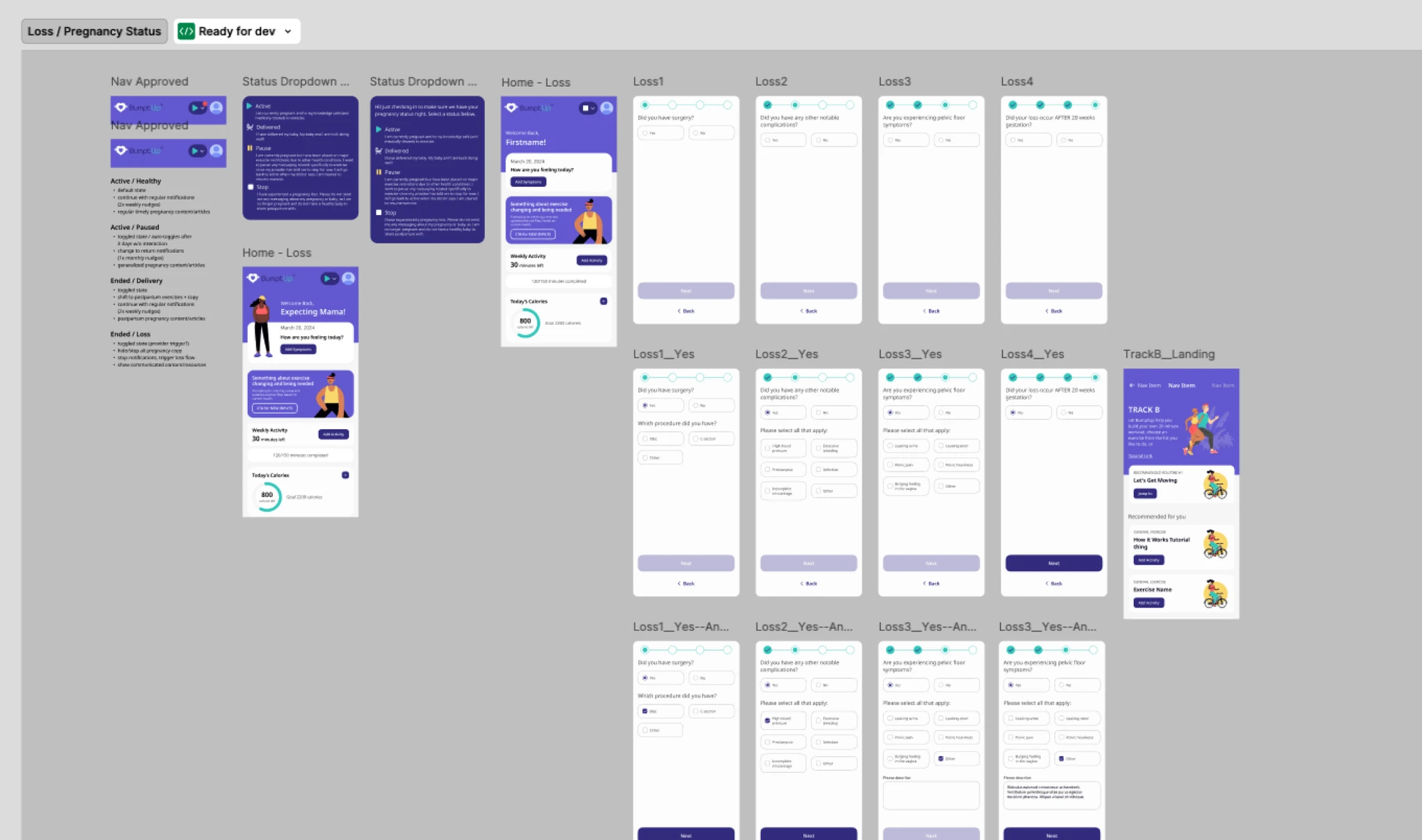
Delivered no alternate experience for sensitive pregnancy journeys.
Pregnancy loss. Complications. High-risk situations. The app didn't account for any of it. Everyone got the same cheerful prompts. That's not just bad UX. That's harmful.
Had no go-to-market strategy or technical roadmap.
Great research. No plan for what happens next. (Science doesn't commercialize itself.)
The challenge was to transform this clinical prototype into a scalable, market-ready product while retaining scientific integrity and expanding the value it could offer to both users and healthcare providers.
My role
Initially engaged through codeLab303 as Director of Strategy, UX, and Experience, I led a comprehensive UX audit and heuristic review of the app, strategic positioning and competitive analysis, redesign recommendations for both UX and brand identity, and the creation of a full GTM strategy, including tactics, timing, and touchpoints.
After this initial engagement, I was invited to become Fractional CTO. Owning the product roadmap, technical architecture, and platform delivery. In that capacity, I:
Directed platform migration.
I advocated for React Native from the start. The agency's engineering team chose Kotlin Multiplatform for architectural reasons that were defensible at the time. When KMP became a bottleneck and I came on as CTO, I made the call to migrate back to React Native, this time using AI-accelerated workflows that compressed 18 months of work into 3. (Sometimes the best decision is the one you come back to.)
Led product strategy.
Co-led feature prioritization and rollout planning. What gets built when, and why.
Oversaw transitions.
Oversaw agency and engineering transitions. Multiple handoffs. Multiple agencies. Kept it stable.
Built design infrastructure.
Led design system development and localization infrastructure. The system needed to support Spanish now, Arabic later, and character sets we haven't thought of yet.
Partnered on clinical features.
Partnered with NIH and SBIR-backed teams to build new clinically-sensitive flows. The pregnancy loss experience was the biggest. Also the hardest.
While this role continues to grow with the product as it embraces more B2B opportunities, the core function of delivering superior pregnancy outcomes and experiences to mothers remains the most interesting and exciting part of the job.
Approach + process
Though the clinical product produced incredible results and data from a scientific perspective, the same rigor and consideration had yet to be applied to product and experience itself. To that end, I undertook a phased approach in helping to refine the BumptUp experience.
Phase 1: Audit, brand positioning + UX redesign
The research prototype had done its job — collecting data. But every clinical artifact that made it useful for researchers made it harder for consumers. The audit mapped where those two needs diverged.
- Conducted a heuristic UX audit to identify friction and clinical artifacts slowing consumer adoption.
- Benchmarked against leading pregnancy apps — most were either too clinical or too fluffy. We found the positioning in between: trustworthy and warm at the same time.
- Removed non-viable features and recommended phased rollout of higher-value ones.
- Developed a new visual identity emphasizing trust, empathy, and confidence. Not medical. Not lifestyle. Something in between.
- Proposed scalable UX patterns and content strategy via a component-based system, improving author experience and easing speed to live for new content.
Phase 2: Platform strategy + transition
I recommended React Native initially. The agency's engineering leadership chose Kotlin Multiplatform with Firebase, RevenueCat, and Looker Studio. The architectural reasoning was sound, but in practice KMP became a bottleneck. Feature updates were cumbersome, slow, and expensive on a startup budget that couldn't afford to pay twice for everything. When I took over as CTO, the case for migrating back to React Native was clear. The harder conversation was the sunk cost one. (That's allowed when the evidence changes. Even twice.)
- Transitioned from externally hosted content to a WordPress-powered in-app CMS. Everything in one place. No more context switching.
- Re-architected food and calorie tracking with barcode scanning, ingredient search, and brand and quantity filters. Zero friction between intention and input.
- Redesigned the exercise flow to keep users in-app. Every time someone leaves, there's a chance they don't come back.
Phase 3: CTO leadership + feature expansion
The KMP-to-React-Native migration could have been a year-long slog. Instead, we leveraged AI-assisted development workflows to rewrite the entire application in 3 months — compressing what originally took 18 months into a single quarter. 100% feature parity plus enhancements. 40% faster development cycles. New features now ship in half the time. As CTO, the call was to push the boundaries of what AI-assisted engineering could deliver for a startup budget. It paid off.
- Directed multi-agency engineering transition, stabilizing delivery velocity. Handoffs are messy. We made them work.
- Led the creation of a pregnancy loss experience — a first-of-its-kind personalized flow triggered via a single opt-in. Users avoid being re-exposed to triggering content. The flow offers physical, emotional, and psychological support. NIH-funded. This was the hardest feature I've ever worked on. Also the most important.
- Launched Spanish localization — full app plus CMS content. Expanded infrastructure to support future RTL Arabic content and character sets. Localization isn't translation. It's rethinking the entire experience for a different context.
- Designed a moderator-less social feature that encourages interaction without letting unmoderated discussion diminish the clinical integrity of the app. (Threaded the needle.)
The solution
BumptUp continues to grow and gain traction among users and practices alike. The most recent roadmap contains numerous features, quality of life improvements, and iterative changes to deliver on BumptUp's mission of creating healthier outcomes for mothers and babies.
Clinical-grade UX
The core flows — calorie tracker, exercise videos, symptom logs — all needed to feel as simple as the science behind them was rigorous. We redesigned each for clarity and ease, then built lightweight survey interfaces that reduced friction while preserving data quality. Every question is a chance to lose someone. We asked only what mattered.
The tension between research rigor and consumer expectations ran through every decision. Holding both at once was the hard part. (Also, honestly, the fun part.)
Community + content innovation
People want community during pregnancy. They also share a lot of misinformation during pregnancy. We designed a semi-social support feature that grouped users by pregnancy stage, location, and activity level, with an emoji and canned-reaction system that reduces moderation needs while retaining evidence-based integrity.
On the content side, we introduced a Reddit topic scanning engine that tracks high-engagement pregnancy topics weekly and monthly, then hands summaries to subject matter experts for new content creation. Let the internet tell us what people care about. Then have experts respond.
Go-to-market + B2B positioning
BumptUp needed two paths to market. Consumers find us through app stores. Providers prescribe us through their networks. We built a dual-path launch strategy to serve both, with pricing and packaging models designed to appeal to clinics and care systems.
The messaging had to differentiate BumptUp from both lifestyle fitness apps and pure medical portals. We're neither. We're both. That's the value.
Outcomes + reflections
BumptUp has gone from zero paid users to initial patient cohorts via provider partnerships. Successful launch on iOS and Android, navigating the product from a clinical setting to commercial viability without diminishing the scientific underpinnings of the original app. The product is now used in 12+ practice settings to support improved pregnancy and postpartum outcomes.
On the engineering side, the AI-accelerated platform rewrite delivered 100% feature parity in a fraction of the original timeline, with 40% faster development cycles and new features shipping in half the time. For a startup running on grant funding, that kind of compression isn't a nice-to-have. It's survival.
What this taught me:
- Holding two truths at once — honoring the precision of clinical research while shaping a warm, accessible, emotionally intelligent experience for users. These aren't opposing forces. They're complementary.
- Knowing when to disagree and when to commit. I lost the platform debate the first time around. When the evidence changed and I had the authority to act, I did. Disagreeing without sabotaging, then course-correcting without blame. That's the harder version of leadership.
- Building trust across stakeholders — researchers, engineers, clinicians, and users all have different priorities. Getting alignment requires speaking all their languages.
- Navigating funding uncertainty while creating a roadmap for scale. Grants are great. They're also unpredictable.
- Translating grief, resilience, and care into UX patterns that feel respectful and human. The pregnancy loss experience required sitting with discomfort. This work changed how I think about design.
This is what it looks like when a clinical tool becomes a product. Grounded in research, rooted in empathy, built to last. And we're not done.